Every map you've ever looked at on a wall has been lying to you, and the lie has a name: the Mercator projection.
Flattening a sphere onto a rectangle is mathematically impossible without some kind of distortion. Mercator's 16th-century solution kept angles accurate for sailors, but at a brutal cost — it massively inflates landmasses the farther they sit from the equator. The result is the map hanging in classrooms worldwide, where Greenland looks roughly the same size as Africa.
It isn't close. Africa is about 11.6 million square miles. Greenland is about 0.8 million. Africa is nearly 14.5 times larger — and most people go their whole lives never knowing it, because the map they grew up with told them otherwise.
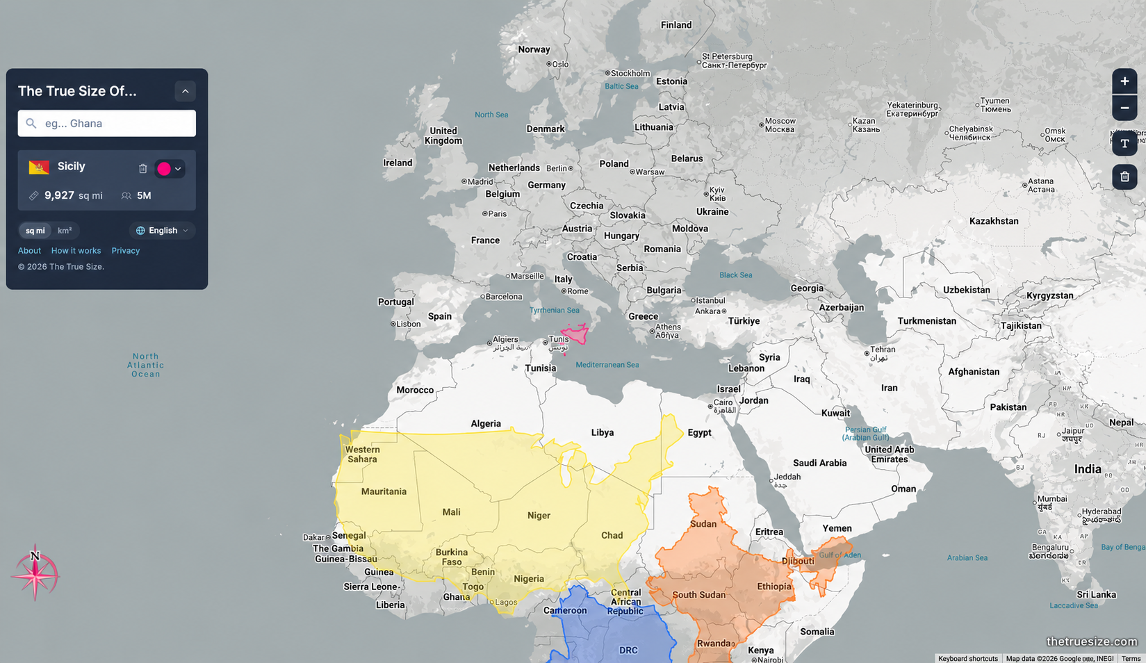
The True Size Of... makes that gap impossible to un-see. Drag any country, state, or province anywhere on the map, and it automatically resizes in real time to show its actual proportions at that latitude. Pull Greenland down over Africa and watch it shrink to a fraction of the size you thought it was. Drag Alaska down to the equator and see it collapse from "practically touching Florida" to a fairly modest landmass.
There are built-in comparisons to jump straight to the classics — Greenland vs Africa, Russia vs Canada, Brazil vs Australia, Australia vs India — but the real fun is picking your own matchups and watching your mental map of the world quietly fall apart.
Built by James Talmage and Damon Maneice, inspired by the well-known "True Size of Africa" infographic and, fittingly, an episode of The West Wing. It's become a staple in geography classrooms for exactly this reason — nothing teaches map projection distortion faster than dragging the distortion around yourself.
Go break your own assumptions. It only takes one drag.